Project Type
Personal
Personal
"Client"
Peelery
Peelery

The "Client"
The "Client"
Peelery is a hypothetical brand specializing in luxurious face masks that rejuvenate and revitalize the skin. The brand’s identity is designed to evoke the essence of boldness and confidence that customers experience after indulging in a Peelery face mask session.
Peelery is a hypothetical brand specializing in luxurious face masks that rejuvenate and revitalize the skin. The brand’s identity is designed to evoke the essence of boldness and confidence that customers experience after indulging in a Peelery face mask session.
The Visual Identity
The Visual Identity
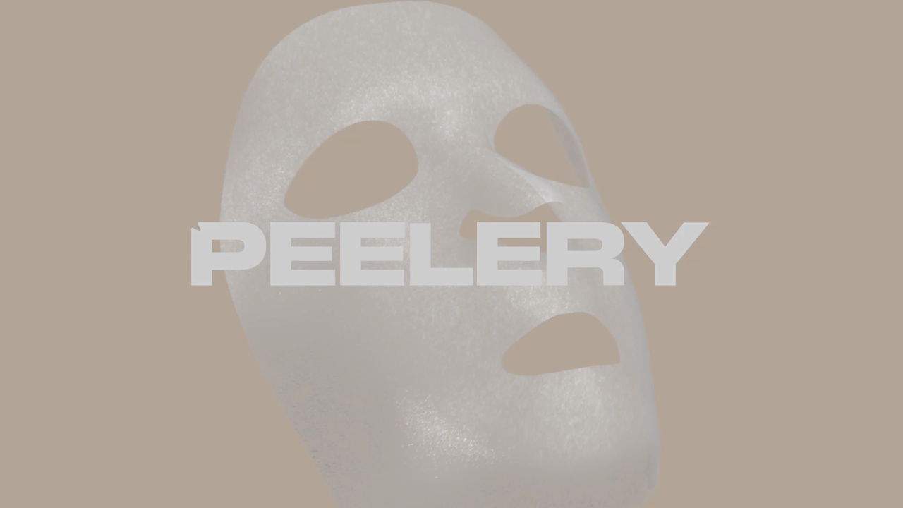
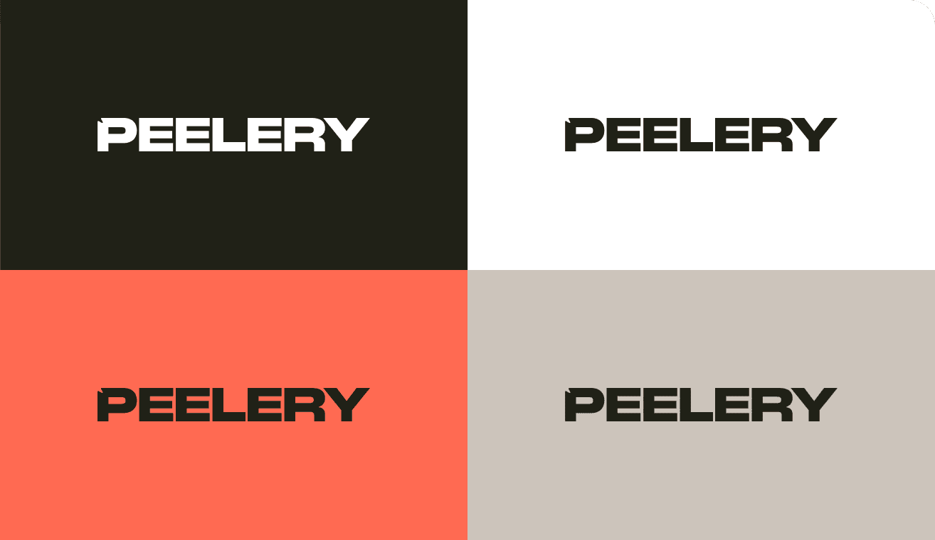
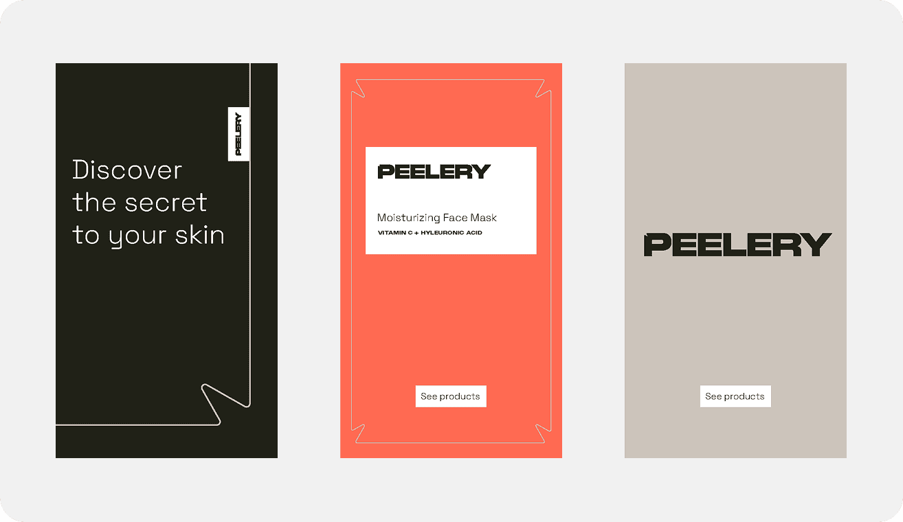
Central to Peelery’s identity is a small shape reminiscent of the folds found in beauty face masks. This graphic element is strategically integrated into the logo, typography, and various design assets. This reinforces brand recognition and cohesion across various touchpoints. It serves as a unifying element, tying together packaging, marketing materials, and digital assets with a distinct and recognizable motif. The color palette is bold yet calming. Peach symbolizes vitality and youthfulness, while black signifies luxury and prestige. Beige complements these colors, exuding warmth and comfort. To invoke a sensory experience for its audience, visual elements revolve around 3D motion design of face masks. These animations capture the transformative experience of using Peelery masks, portraying the evolution from application to removal with fluidity and grace.
Central to Peelery’s identity is a small shape reminiscent of the folds found in beauty face masks. This graphic element is strategically integrated into the logo, typography, and various design assets. This reinforces brand recognition and cohesion across various touchpoints. It serves as a unifying element, tying together packaging, marketing materials, and digital assets with a distinct and recognizable motif. The color palette is bold yet calming. Peach symbolizes vitality and youthfulness, while black signifies luxury and prestige. Beige complements these colors, exuding warmth and comfort. To invoke a sensory experience for its audience, visual elements revolve around 3D motion design of face masks. These animations capture the transformative experience of using Peelery masks, portraying the evolution from application to removal with fluidity and grace.
Central to Peelery’s identity is a small shape reminiscent of the folds found in beauty face masks. This graphic element is strategically integrated into the logo, typography, and various design assets. This reinforces brand recognition and cohesion across various touchpoints. It serves as a unifying element, tying together packaging, marketing materials, and digital assets with a distinct and recognizable motif. The color palette is bold yet calming. Peach symbolizes vitality and youthfulness, while black signifies luxury and prestige. Beige complements these colors, exuding warmth and comfort. To invoke a sensory experience for its audience, visual elements revolve around 3D motion design of face masks. These animations capture the transformative experience of using Peelery masks, portraying the evolution from application to removal with fluidity and grace.


The Motion Concept
The Motion Concept
Peelery’s motion identity adheres to a set of guidelines, ensuring consistency across all animated elements. In it’s typography, Peelery captures the essence of its brand by simulating the act of subtly ‘peeling back’ each word. This mirrors the tactile experience of unveiling refreshed and radiant skin after using the product. The animation of Peelery’s central graphic element, the mask-like fold, is used in both the logo animation and shape animation. This animation technique aims to add visual interest, as well as reinforce brand recognition by showcasing the distinctive folds reminiscent of a face mask. It is used cohesively in every animation, ensuring a consistent brand experience. Each animated element is designed to evoke a sense of excitement and elegance, inviting its customers in to a immersive brand experience.
Peelery’s motion identity adheres to a set of guidelines, ensuring consistency across all animated elements. In it’s typography, Peelery captures the essence of its brand by simulating the act of subtly ‘peeling back’ each word. This mirrors the tactile experience of unveiling refreshed and radiant skin after using the product. The animation of Peelery’s central graphic element, the mask-like fold, is used in both the logo animation and shape animation. This animation technique aims to add visual interest, as well as reinforce brand recognition by showcasing the distinctive folds reminiscent of a face mask. It is used cohesively in every animation, ensuring a consistent brand experience. Each animated element is designed to evoke a sense of excitement and elegance, inviting its customers in to a immersive brand experience.
Peelery’s motion identity adheres to a set of guidelines, ensuring consistency across all animated elements. In it’s typography, Peelery captures the essence of its brand by simulating the act of subtly ‘peeling back’ each word. This mirrors the tactile experience of unveiling refreshed and radiant skin after using the product. The animation of Peelery’s central graphic element, the mask-like fold, is used in both the logo animation and shape animation. This animation technique aims to add visual interest, as well as reinforce brand recognition by showcasing the distinctive folds reminiscent of a face mask. It is used cohesively in every animation, ensuring a consistent brand experience. Each animated element is designed to evoke a sense of excitement and elegance, inviting its customers in to a immersive brand experience.